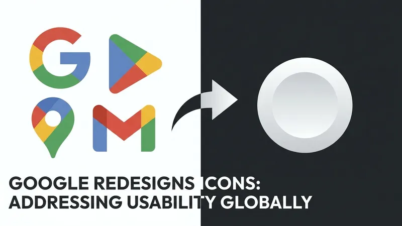
About five years ago, Google redesigned the icons for most of its apps and services, including widely-used tools like Drive, Meet, and Calendar. The internet's response was not positive, and with good reason. Many correctly pointed out that Google removed the individual defining characteristics of its icons, replacing them with uniform outlines made up of the company's signature four colors. While the outline of a document for Google Docs or a camera for Meet was recognizable upon close inspection, at a glance, these icons were much harder to differentiate than the ones they replaced.
In a win for legibility, Google is changing course. The transition began a few months ago with a more distinctive icon for Google Maps, featuring greater visual depth while still incorporating Google's colors and the ubiquitous pin design. Recently, 9to5Google revealed that a full-scale redesign was on its way. Now, coinciding with Google I/O, those redesigned icons are officially rolling out.
The new designs are already appearing in the "app switcher" within personal Gmail accounts on the web. While these icons haven't propagated everywhere yet—clicking into Drive or Calendar may still display the old ones—several Google apps on iOS have also been updated, indicating a full-scale launch is in progress.
While many users eventually accustomed themselves to the previous generation of flat icons, there is no doubt that these new designs represent a major usability improvement. They make it significantly easier to distinguish apps at a quick glance. Furthermore, these icons closely align with the redesigned 3D emojis that Google introduced as part of its recent Android design language updates.
[AgentUpdate Depth Analysis] Google's shift from flat, homogenous icons back to high-contrast, pseudo-3D designs is more than a mere aesthetic regression; it is a critical evolution for Human-Computer Interaction (HCI) in the AI Agent era. As intelligent agents increasingly mediate our workflows, they rely heavily on tool-use and function calling across platforms like Gmail, Drive, and Calendar. Distinctive visual anchors not only lower the cognitive load for human users but also enhance screen-understanding capabilities for multimodal AI models acting on behalf of users. Moving forward, "Agentic UI" will likely transcend 2D grids, evolving into dynamic, adaptive canvases. These redesigned icons serve as recognizable gateways to the Agent’s "action space," establishing a clearer mental model and fostering deeper trust in autonomous multi-agent orchestration.